How my cube colours work
I wanted to do something fun with the timestamping of the posts on this blog. The old blog had a cute script that would place and colour a circle based on the time, sort of reflecting where the sun would have been in the sky. I even used a library to figure out when the sunset would have been on that day and time, in Toronto, and put in some sunset colours as appropriate.
With my new blog design I wanted to do something similar.
I thought it would be nice to do something with gradients and I was delighted to discover that CSS now has that! This saves me having to dynamically generate an image for each unique timestamp, and saves me having to learn how I would even do that on Jekyll.
Just for fun, here’s the breakdown of my cube’s styling:
The static CSS I started with
1. Mask out the cube shape with a png
background:url('/assets/images/cube-cutout.png'),
red
2. Add a gradient “behind” the png
background:url('/assets/images/cube-cutout.png'),
linear-gradient(27deg, rgba(255, 255, 255, 0), rgba(255, 17, 178, .66))
3. Add a second gradient
background:url('/assets/images/cube-cutout.png'),
linear-gradient(27deg, rgba(255, 255, 255, 0), rgba(255, 17, 178, .66)),
linear-gradient(90deg, rgba(255, 230, 243, .77), rgba(255, 200, 0, 1))
4. …and a third
background:url('/assets/images/cube-cutout.png'),
linear-gradient(27deg, rgba(255, 255, 255, 0), rgba(255, 17, 178, .66)),
linear-gradient(90deg, rgba(255, 230, 243, .77), rgba(255, 200, 0, 1)),
linear-gradient(193deg, rgba(255, 255, 255, 1), rgba(145, 164, 220, 1))
5. Convert the colours with hue (the ones that aren’t white) to hsla format
This makes it easier to shift all the hues based on the time of day in the next part
background:url('/assets/images/cube-cutout.png'),
linear-gradient(27deg, rgba(255, 255, 255, 0), hsla(319deg, 100%, 53%, .66)),
linear-gradient(90deg, hsla(329deg, 100%, 95%, .77), hsla(47deg, 100%, 50%, 1)),
linear-gradient(193deg, rgba(255, 255, 255, 1), hsla(225deg, 52%, 72%, 1));
Making it dynamic with a Jekyll filter
1. Calculate the number of minutes into the day
minutes_into_the_day = (date.hour * 60) + date.min
2. Describe the distance into the day as an angle in degrees
minutes_as_angle = (minutes_into_the_day / (24.0 * 60)) * 360
3. Make a method for adding angles
    def add_angles(ang1, ang2)
      (ang1 + ang2) % 360
    end
4. Offset each hue angle based on minutes_as_angle
I’m sure this is less than idiomatic Ruby. At least it likely matches the quality of my CSS…
      "background:
         url('/assets/images/cube-cutout.png'),
         linear-gradient(27deg, rgba(255, 255, 255, 0), hsla(#{add_angles(minutes_as_angle, 319)}deg, 100%, 53%, .66)),
         linear-gradient(90deg, hsla(#{add_angles(minutes_as_angle, 329)}deg, 100%, 95%, .77), hsla(#{add_angles(minutes_as_angle, 47)}, 100%, 50%, 1)),
         linear-gradient(193deg, rgba(255, 255, 255, 1), hsla(#{add_angles(minutes_as_angle, 225)}deg, 52%, 72%, 1));
       background-size: 104px 118px;"
5. Use the filter in the liquid template
<div class="timebox" style="{{ page.date | box_style_from_date }}"></div>
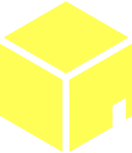
6. Voila! Time as a cute little chromatic cube!
0:00am
4:00am
8:00am
12:00pm
4:00pm
8:00pm
If I were really on my game I’d have made a cool JS thing that would let you move a slider around and see the colours cycle all slick-like.
Maybe tomorrow…